Appearance
User
Blob top menu bar

- logo > customisation from admin/theme
- Search or paste URL > search an item belonging to a blob, or paste a custom URL to be added as item (admin credentials required)
- About > the instance about page, customise from admin/theme
- Blobs > explore and search by Blobs (curated collection of sources/items)
- Tags > explore and search by TAGS (item/blobs properties)
- Share > blobs sharing by embedding
- Language > change UI language
- Sign-in > unlock admin powers
About
In the About page you can find a short description of a specific blob install. This About page description can be modified by the admins.
Below the description, a list of the sources is displayed. For every source you have an overlook, namely:
- a feed link, created by the blob install
- the number of posts taken from the source
- the name of the source
- the web link of the source
- the description of the source.
N.B.: the source name and description can be overridden by admins if there is no suitable name/descrition into the feed of the source. Therefore, name and description may not be the responsibility of the source.
Menu items
Menu items displayed in home page, such as here, are created accordingly to blobs. A single blob is a mix of content taken from selected sources, filtered by tags. E.g. the C.I.R.C.E. & co. page is the blob C.I.R.C.E. & co. displayed as a Menu item in the home page.

Search the blobs
Search the blobs is not case-sensitive and full-text search of the selected contents taken from the selected sources.

Blobs
A Blob is a grouping of content taken from chosen sources, possibly filtered by tag. Blobs are the blobs collected by a given blob instance.
Tags
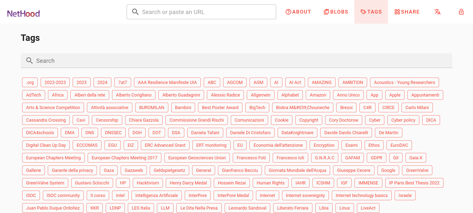
Tags are all the tags categorizing the contents taken from the sources. There is an interactive Search to easily browse tags, just start typing into the Search field.

Search the Tags
Search the Tags is not case-sensitive and full-text search through the tags. Just start typing to make it works. E.g. if you start typing "p", you will have a first selection including "privacy" tag (start with "p"), but also "GDPR" tag (it has a capital "P" in the third position).
Share a blob
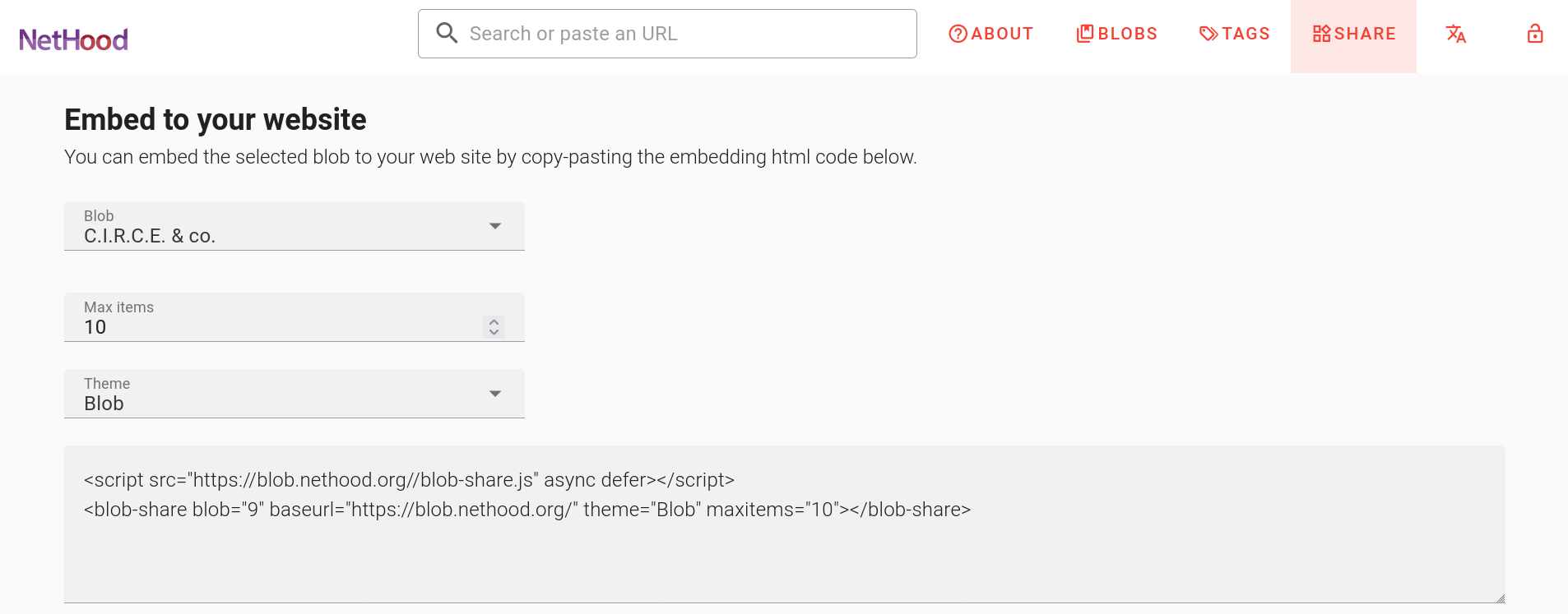
The share menu gives you the possibility to embed a blob into your website or anywhere else on the web.
- Select an existing blob from the list
- Choose between Dark Mode or Light Mode, Sidebar (no images) or Body (with images).
- Once you've found your preferred embedding, copy the code snippet below.
- Now paste the snippet into a page of your website and save.
et voilà! The blob is now feeding back your website.
N.B.: In the blob 1.0 release you have four embedding style combination: Dark Mode + Sidebar; Light Mode + Sidebar; Dark Mode + Body; Light Mode + Body. Starting wit the blob 1.8.x releases, the concept of theme has been introduced and now you have six embedding style themes, dubbed under the names: Blob and Blob Dark; Sidebar and Sidebar Dark; Grid and Grid Dark. Another new feature you can control from the embed snippet is the number of posts to be displayed in the embedding - by default is 10. The snippet code changes accordingly to your choices.

What is the code snippet?
Have a look at the share menu, choose your preferred Mode for the embedding. Below will appear the code snippet,
Something like:
<script src="https://blob.nethood.org/blob-share.js" async defer></script>
<blob-share blob="9" baseurl="https://blob.nethood.org/" theme="Blob" maxitems="10"></blob-share>N.B.: remember to check the url string, in this example "blob.nethood.org" with the blob domain you're taking the blob from.
Administration
Sign In
Add a new source
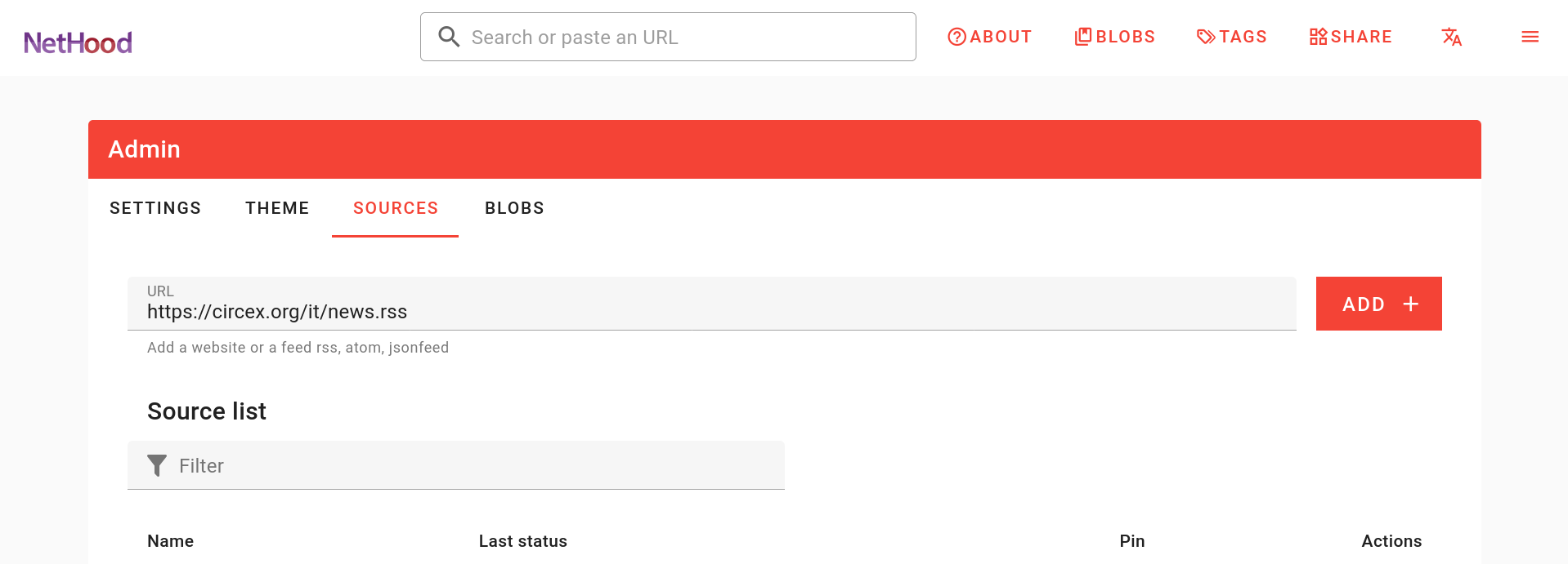
To add a new source, you have to find the RSS feed. It's a good idea to check the RSS feed before adding it to a blob instance.
Now you can open the admin source tab - the link should be someting like https://<YOUR-DOMAIN>/admin?tab=sources , copy-paste your RSS feed link and click the ADD button

Add a new URL
You can also add a specific page or post using its fix URL on the search field at the home page.
Note: Image and description need to be available at the Open Graph section of the page.
Create a new user
Reset user password
Remove a user
Check source RSS status
A very useful tool to check the RSS feed status of the sources is the Firefox add-on "Livemarks". https://addons.mozilla.org/en-US/firefox/addon/livemarks/
Even if the RSS feed is displayed correctly on the browser it might not appear on your blob platform. The W3C Feed validator will most probably give some warning which can help you improve the RSS feed at the source: https://validator.w3.org/feed/.
In any case, please create an issue with the problematic source here: https://codeberg.org/lesion/blob/issues
Source admin
RSS is enabled by default in many popular CMSes like Wordpress, Kiwix, grav, and more.
However, in every case there are special issues to be taken care of.
Enable RSS feed
It is possible that RSS is not enabled although supported and you need to check how it works for your CMS.
In the case of Wordpress, RSS is enabled by default for the posts, and not for static pages.
Validate RSS
To be sure that your RSS feed will display properly on a blob platform it is important to validate it here: https://validator.w3.org/feed/
Generate RSS feed
When RSS is not supported it is possible that it is manually implemented. We are exploring different solutions for this option, to be documented here.
Theming

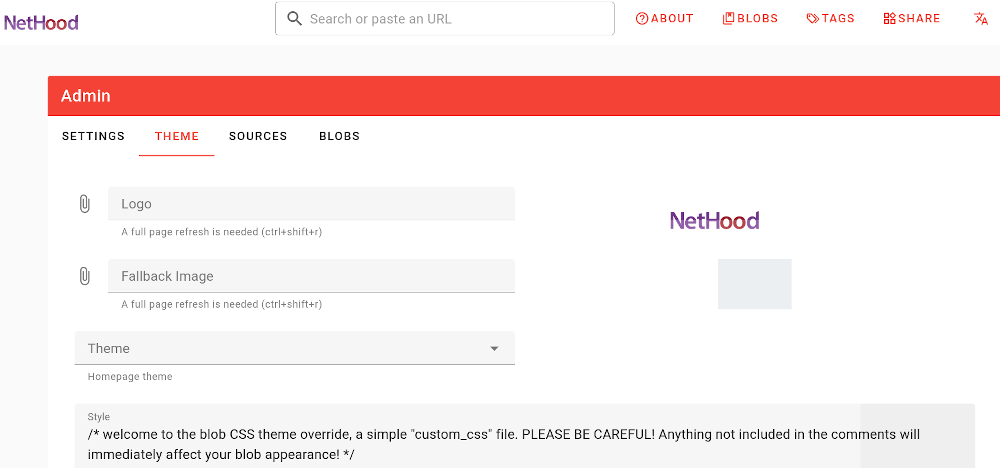
Logo, fallback images and othe feature for theming and display customisation are available in the /admin?tab=theme tab of the admin menu. In addition, an override css can be edited directly from the /admin?tab=theme tab. PLEASE BE CAREFUL!: changes are immediately effective! If a rule you add to the code does not show up, even after a browser cache refresh, consider adding the selector "!important;" at the end of the line to be overriden. Remember to reload the page with a refresh, by empting the cache of your web browser: in Linux/Windows press CTRL+SHIFT+R on Firefox; CTRL+F5 on Chrome. Also, logout from admin and login again to check if your override is effective Before override CSS in the /admin?tab=theme, we strongly advice to tinker with the inspector in your browser
CSS playground
below a commented CSS. Copy-paste, uncomment and edit the lines you need into your style window - /admin?tab=theme tab in the admin menu.
/* welcome to the blob CSS theme override, a simple "custom_css" file. PLEASE BE CAREFUL! Anything not included in the comments will immediately affect your blob appearance! */
/* TIPS */
/* if a rule you add to the code does not show up, even after a deep browser cache refresh, consider adding the selector "!important;" at the end of the line to override */
/* clear the cache of your web browser: in Windows press CTRL+SHIFT+R on Firefox; CTRL+F5 on Chrome */
/* logout from admin and login again to check if your override is effective */
/* before changing here, we strongly advice to tinker with the inspector in the browser https://firefox-source-docs.mozilla.org/devtools-user/page_inspector/how_to/examine_and_edit_css/index.html */

/* make the logo bigger by changing the height of the toolbar */
 /* .v-toolbar-title img {
height: 100px;
}*/

/* styling number of cards per line - default 3 cards = 300px; 5 cards = 200px */
/*.theme-Grid .postContainer {
    grid-template-columns: repeat(auto-fit,minmax(300px,1fr)) !important;
}*/

/* styling cards summary */

/* hide the cards summary > display: none; */
/* - max-height changes the number of text lines - 60px default */
/*.content .summary {
    display: none;
	max-height: 60px !important;
}*/

/* font styling */

/* change font https://developer.mozilla.org/en-US/docs/Web/CSS/font */
/* font family https://developer.mozilla.org/en-US/docs/Web/CSS/font-family */
/* font size https://developer.mozilla.org/en-US/docs/Web/CSS/font-size*/
/* line-height https://developer.mozilla.org/en-US/docs/Web/CSS/line-height */

/* html {
	font-family: Garamond,serif;
	font-size: 1rem;
	line-height: 1.5;
} */

/* listing the custom classes
    #blob_appbar
    #blob_logo
    #blob_main
    #blob_tagline
    #blob_blobs
*/

/* examples customisation of the #blob_appbar class */

/* remove blobs and share from menu */
/*#blob_appbar .Blobs,
#blob_appbar .Share {
  display: none !important;
}*/

/* hide the language button */

/*#blob_appbar button.Translate {
	display: none;
} */

/* hide the About button - example on one line */

/*#blob_appbar .About .label { display: none; }*/

/* style blob tagline */
/*#blob_tagline
{
  margin-bottom:25px; !important;
  font-weight: bold;
  width:70%;
}*/

/* examples customisation of the #blob_buttons class */
/*#blob_blobs
{
  margin-bottom:40px; !important;
}*/

/*#blobs_blob .description
{
  margin-top:40px; !important;
}*/

/*#v-field__field
{
width: 70%;
margin-bottom:40px; !important;
}*/

/* workaround for border thickness and style */
/* reference: https://developer.mozilla.org/en-US/docs/Web/CSS/border-style */

/*.post.card {
  border-width: 4px !important;
  border-style: dotted !important;
}*/

/* adding a box-shadow to .post.card */
/* https://developer.mozilla.org/en-US/docs/Web/CSS/box-shadow */
/* :hover pseudo-class with "unset" revert to "normal" */
/* opacity is for every .post.card */

/*.post.card {
    box-shadow: 5px 5px 5px aquamarine;
    background-color: bisque;
}*/

/*.post.card:hover {
    box-shadow: unset;
    background-color: unset;
    opacity: 0.6;
}*/


/* style single blob buttons */
/* LtR > nth-child(1) nth-child(2) etc.*/

/* a.v-btn--variant-outlined:nth-child(1) {
color: aqua;
}*/

/*a.v-btn--variant-outlined:not(:first-child) {
  content: "/";
  display: inline;
}*/

/* style buttons font black. eg: no border, yellow background*/

/*a.v-btn--variant-outlined {
	color: black;
	background: yellow;
	font-size: large;
	font-weight: bold;
	border: none;
	border-radius: 0px;
}*/

/*a.v-btn--variant-outlined {
  color: black; !important;
  border: none; !important;
  background-color: yellow; !important;
  font-size: large;
  font-weight: bold;
  border-radius: 0px;
}*/

/* background button. eg.: light blue */

/*a.v-btn--variant-outlined:hover {
background: #00ffff;
}*/

/*.blobs a.v-btn--active {
    background-color: #00ffff;
}*/

/*add a border radius to images, add transition*/
/*.media img, .media picture {
##	aspect-ratio: 1.7778;
##	border: 1px solid #eee;
##	height: 100%;
##	-o-object-fit: cover;
##	object-fit: cover;
##	width: 100%;
	border-radius: 3%;
    transition: transform 1s ease-in-out;
}*/

/*add a transform scale image:hover*/

/*.media img, .media picture:hover {
transform: scale(1.2);
}*/

/* style ONLY the title of the postcard */
.font-weight-bold.text-secondary {
	    font-size: 1.2rem;
	    text-decoration-line: none;
        font-weight: normal important;
        font-style: italic;
        line-height: 0.8em important;
	/* text-decoration-style: dotted; */
}

/* style ONLY the footer of the postcard */
.font-weight-light.text-caption.footer {
    font-size: 1rem !important;
	/* text-decoration-line: underline; */
	/* text-decoration-style: dashed; */
}

/* style ONLY the source name in the postcard */
.font-weight-light.text-caption.footer {
	/* font-size: large !important; */
	/* text-decoration-line: overline; */
	/* text-decoration-style: solid; */
}

/* style BOTH the title AND the source name of the postcard */
.text-secondary {
	/* font-size: large !important; */
	/* text-decoration-line: line-through; */
	/* text-decoration-style: double; */
}

/* align the footer to the bottom (tags) */
.post.card .footer {
  margin-top: auto;
}

/* style TAGS of the postcard */
.v-chip__content {
	font-size: large;
}


/* change the toolbar div shadow, eg from black to white */

.theme-Grid .post .actions:hover {
	## background: transparent;
	background-image: linear-gradient(180deg,#fff,transparent);
	## left: 0;
	## padding-bottom: 10px;
	## position: absolute;
	## top: -60px;
	## transition: top .2s ease-in-out;
	## width: 100%;
}

/* styling actions eg toolbar background gradient */
/* make it white */
.theme-Grid .post .actions {
  background-image: linear-gradient(to bottom, rgba(255,255,255, 1) , rgba(0,0,0,0)) !important;
 ## background: transparent;
}

/* hack to reorder the card sections - need better classes! */

/*.post.card .content > a{
    order:1;
}
.post.card .content > section{
    order:2;
}
.post.card .content > span{
    order:3;
}*/

/* source_number class as customisation toolkit */
/* the source_number class follow (or not) the color selected into the admin UI theme, see above */

/*.source_26 .text-secondary {
    color: rgb(122, 89, 162) !important;
}

.source_34 .text-secondary {
    color: #000000 !important;
}*/

/* customising the display of text-secondary link for soruces */
/*.text-secondary {
    font-weight: bold;
    text-decoration: none;
}*/

/* styling the embedding CSS - example: https://cisti.org/test/ */
/* check the source of the snippet for share */
/*eg <blob-share blob="4" baseurl="https://zecche.org" sidebar="true" dark="false" external_style="https://cisti.org/test/blob3.css?nocache"></blob-share> */

/* the important attribute for CSS embedding is called external_style */
/* a css example: https://cisti.org/test/blob3.css?nocache */